Content Overview
The content tab gives you insight into your content performance, and helps you answer the following questions:
- Which content assets are generating the most engagement across content tracks?
- What types of content are your visitors most engaged with?
- Which topics are your visitors most interested in?
Example of Using Filters in Content Library
|
Note
|
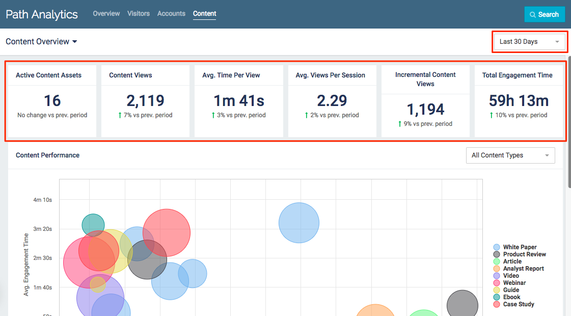
Use the drop-down menu in the top right corner to select a time frame. All data displayed will be from the selected period of time (7, 30, 60, 90, or 365 days). |
Active Content Assets: Total number of content assets which were in at least one of your Content Tracks.
Content Views: Total number of content asset page views to all content assets in all Content Tracks.
Avg. Time per View: Average amount of time visitors spent per page view. This is calculated by dividing the Total Engagement Time by Content Views.
Avg. Views per Session: Average number of content asset page views by visitors during a session. This is calculated by dividing Content Views by the total number of sessions.
|
Note
|
For more information on what a session is check out the glossary. |
Incremental Content Views: Total number of binged content asset pageviews. These are any content asset pageviews which occurred after an initial content asset was viewed.
Total Engagement Time: Total amount of time visitors spent viewing your content across all Content Tracks.
Content Performance Chart
This chart displays the different types of content your visitors have viewed.
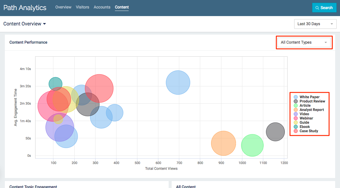
Content Performance Chart Example
- Each bubble represents a content asset
- The color of the bubble reflects the Content Type of that content asset
- If no content type has been set for a content asset it will still appear in the chart, listed as “No Content Type” in the legend
- Bubble size reflects the cost of the content asset
- Bigger bubbles represent higher cost content assets
- If a content asset does not have an assigned cost it will default to the smallest bubble size
- Hover over a bubble for more information about the content asset
- Total Views: Total number of pageviews the content asset received during the selected time frame
- Average Engagement Time: The average amount of time visitors spent with the content asset. This is calculated by dividing the Total Engagement Time by the Total Views
- Content Cost: The estimated cost of the content asset (for more information on estimated cost, see the glossary)
- Content Type: The name of the Content Type Tag the content asset was tagged with
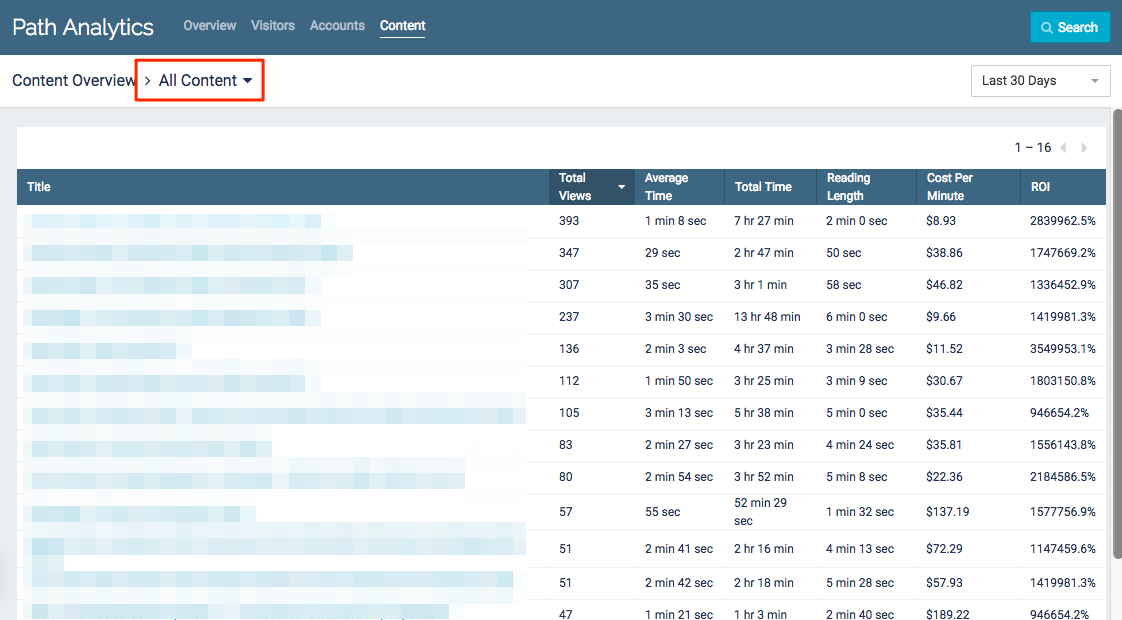
All Content
The All Content table provides a list of all content assets which have been viewed within the selected time frame.
All Content Table Example
- Click on the column headings to sort by Total Views, Total Time, or Cost Per Minute.
- Click on any content asset title to access more detailed data on that specific asset.
- Use the drop-down menu in the top right corner to select a time frame. All data displayed will be from the selected period of time (7, 30, 60, 90, or 365 days).
Title: The Internal Name of the content asset.
Total Views: Total number of times the content asset was viewed by visitors within the selected time frame.
Average Time: The average amount of time visitors spent viewing the content asset. This is calculated by dividing Total Time by Total Views.
Total Time: Total amount of time visitors spent viewing the content asset.
Reading Length: The estimated amount of time it takes to read the content asset.
Cost Per Minute: This metric is calculated by dividing the cost of the content asset by Total Time within the selected time frame.
ROI: Return on Investment is calculated by dividing the total closed-won revenue which the content asset influenced by the estimated cost of the content asset, multiplied by 100 to produce a percentage.
Specific Content Asset
Select a content asset from anywhere in Path Analytics to get deeper insights into how that particular content generated engagement.
|
Note
|
Know what you’re looking for? Use the search bar to quickly find a specific content asset! |
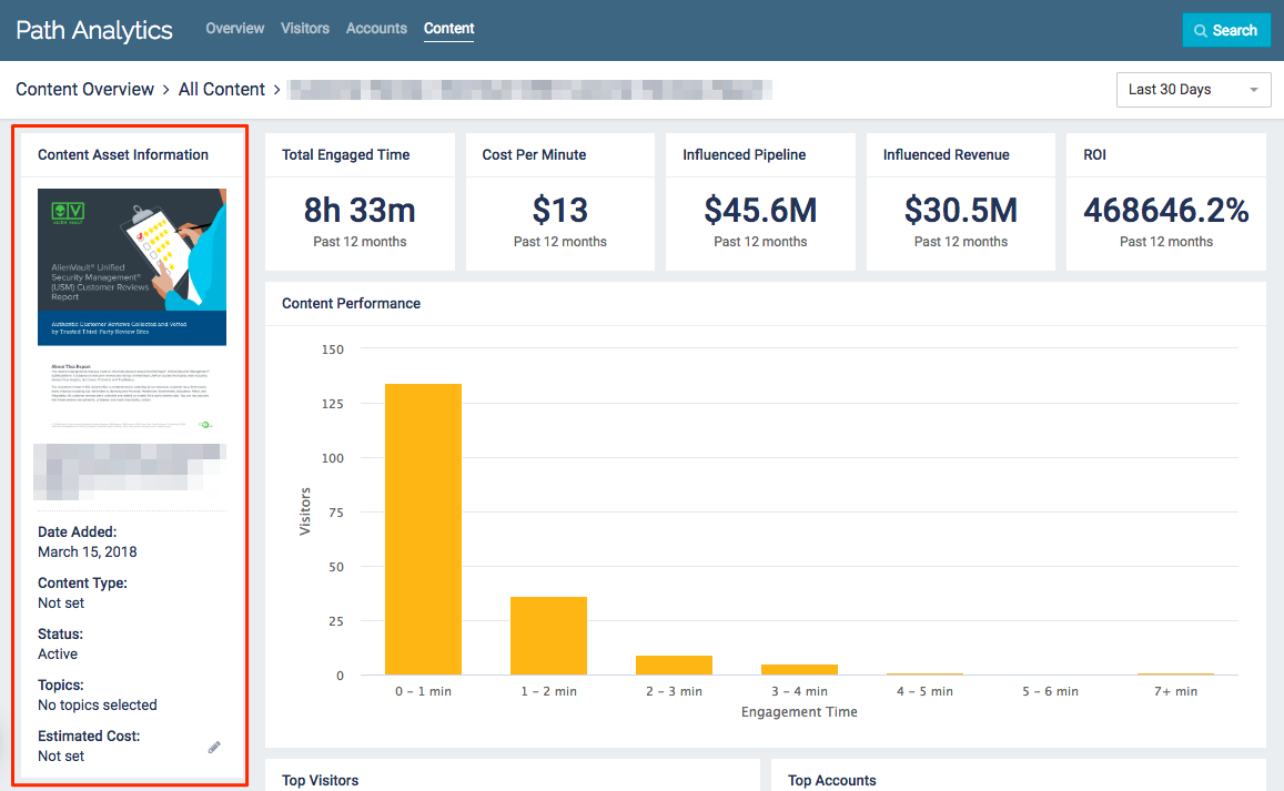
Content Asset Information
The only field you can edit in this section is the Estimated Cost. Changing this value will also change the Cost Per Minute and ROI. Any changes made on this page will also update the content asset’s information in the Content Library.
|
Note
|
If you want to edit any of the other fields, you can do so in the Content Library. |
Estimated Cost Example
Content Asset Insights
Content Library
- Use the drop-down menu in the top right corner to select a time frame. All data displayed will be from the selected period of time (7, 30, 60, 90, or 365 days).
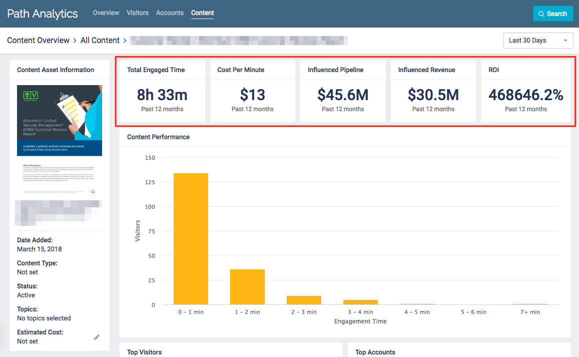
Total Engaged Time: Total amount of time all known and unknown visitors spent viewing the content asset within the past 12 months.
Cost per Minute: This metric is calculated by dividing the estimated cost of the content asset by the total minutes of engagement.
Influenced Pipeline: Total amount of money from both open and closed-won opportunities which have been influenced by the specific content asset.
Influenced Revenue: Total amount of money from closed-won opportunities which have been influenced by the specific content asset.
ROI: Return on Investment for any given content asset is calculated by dividing the total closed-won revenue which the content asset influenced by the estimated cost of the content asset, multiplied by 100 to produce a percentage.
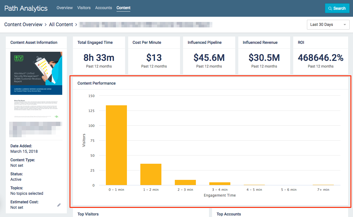
Content Performance Graph
This graph depicts the number of visitors who viewed the content asset, grouped according to the engagement time the content asset generated.
Content Performance Example
- Use the drop-down menu in the top right corner to select a time frame. Data shown in this graph will change depending on which time frame is selected.
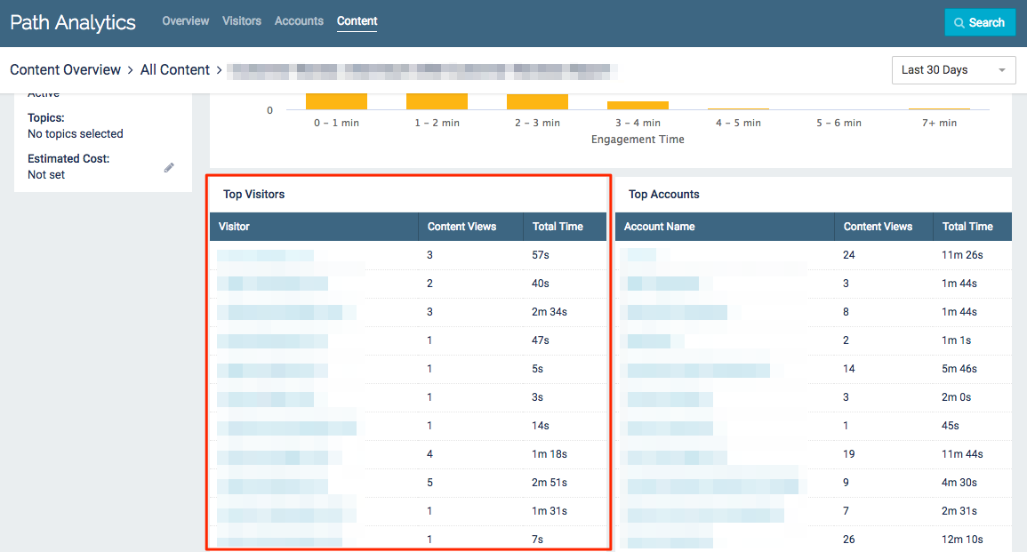
Top Visitors
This list displays the top 20 visitors who have engaged with the content asset, according to total time spent viewing the content asset.
Top Visitors Example
- Click on any visitor to access more detailed data on that specific visitor.
- Use the drop-down menu in the top right corner to select a time frame. Data shown in this list will change depending on which time frame is selected.
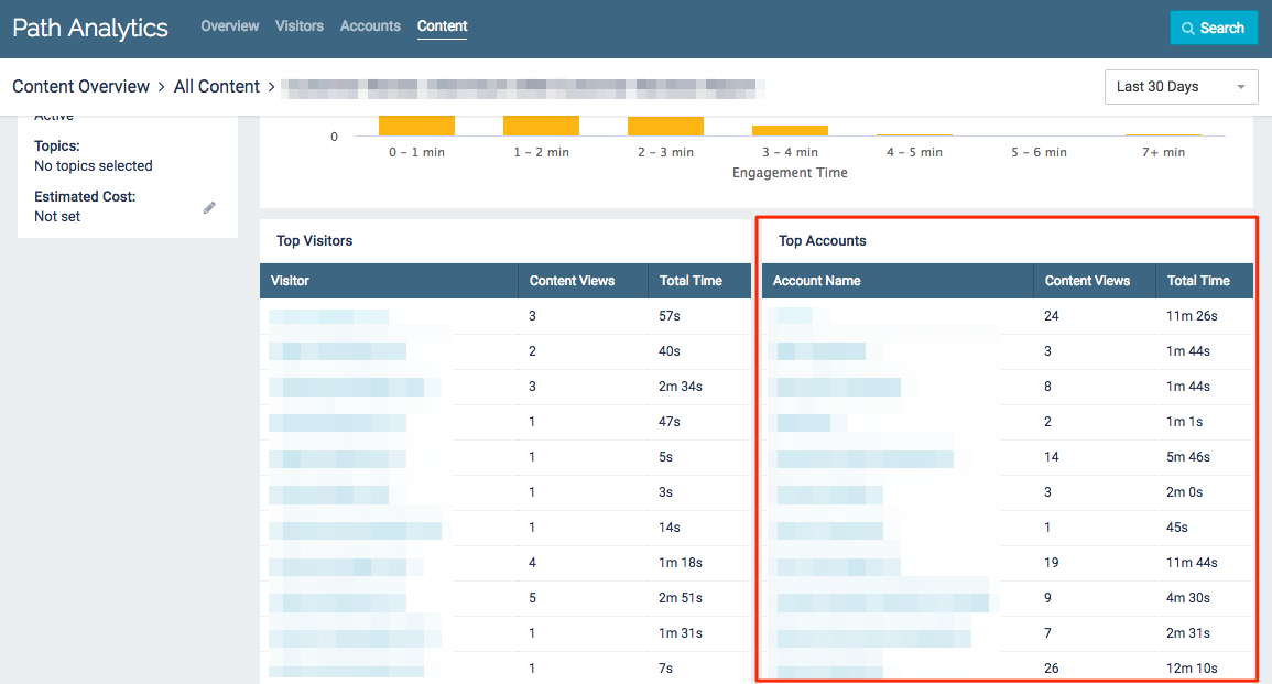
Top Accounts
This list displays the top 20 accounts who have engaged with the content asset, according to total time spent viewing the content asset.
Top Accounts Example
- Click on any account to access more detailed data on that specific account
- Use the drop-down menu in the top right corner to select a time frame. Data shown in this list will change depending on which time frame is selected.
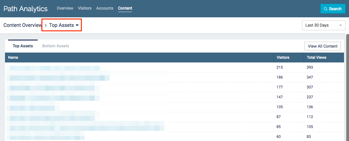
Top Assets
The Top Assets table provides a list of your top 20 content assets according to their total page views.
This table also provides the total number of visitors each content asset had.
Top Assets List
- Click on any content asset title to access more detailed data on that specific asset.
- Use the drop-down menu in the top right corner to select a time frame. All data displayed will be from the selected period of time (7, 30, 60, 90, or 365 days).
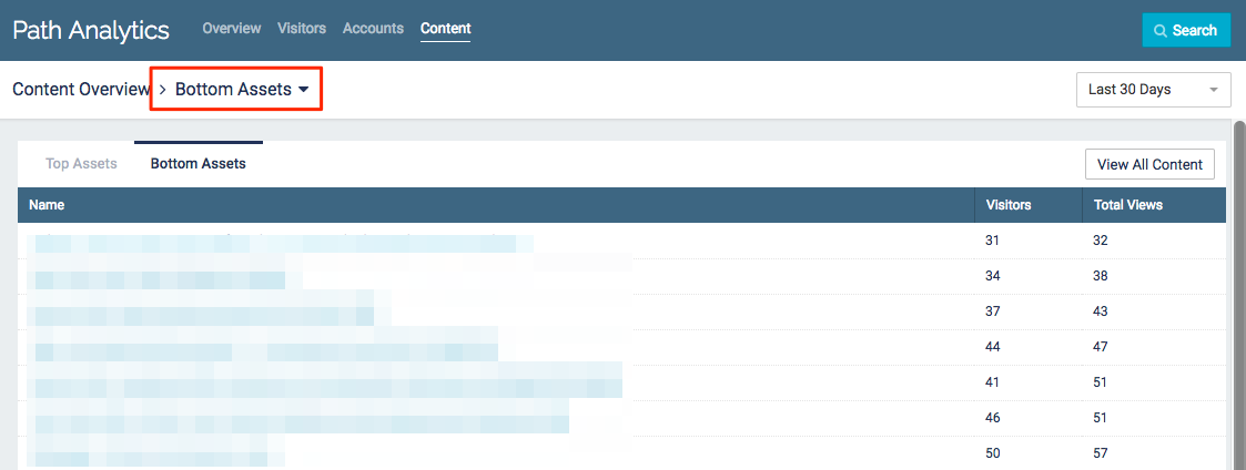
Bottom Assets
The Bottom Assets table provides a list of your bottom 20 content assets according to their total page views.
This table also provides the total number of visitors each content asset had.
Bottom Assets List
- Click on any content asset title to access more detailed data on that specific asset.
- Use the drop-down menu in the top right corner to select a time frame. All data displayed will be from the selected period of time (7, 30, 60, 90, or 365 days).
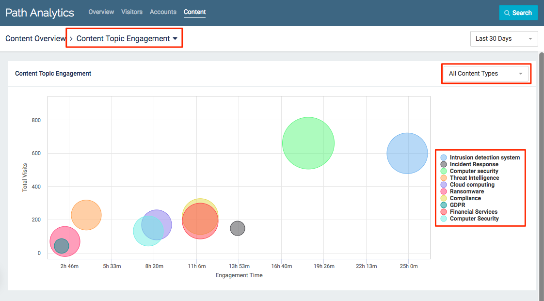
Content Topic Engagement
This chart displays the topics your visitors have engaged with, plotted against total engagement time and total visits.
Content Topic Engagement Example
- Bubble size is determined by the number of content assets with that topic
- Hover over a bubble for more information about the topic
- Engagement Time: Total amount of time visitors spent viewing content assets tagged with this topic
- Total Visits: Total number of page views for content assets tagged with this topic
- Content Assets: Total number of content assets tagged with this topic which have been viewed within the given time frame